 English
  Русский
  简体中文
简体中文  Português do Brasil
  Français
  Español
  Türkçe
  Polski
  Tiếng Việt
  한국어
한국어  Nederlands
  Italiano
  日本語
日本語  Eesti
Eesti  Čeština
  മലയാളം
  Bahasa Melayu
  हिन्दी
  اردو
اردو  Bahasa Indonesia
 Safe Web
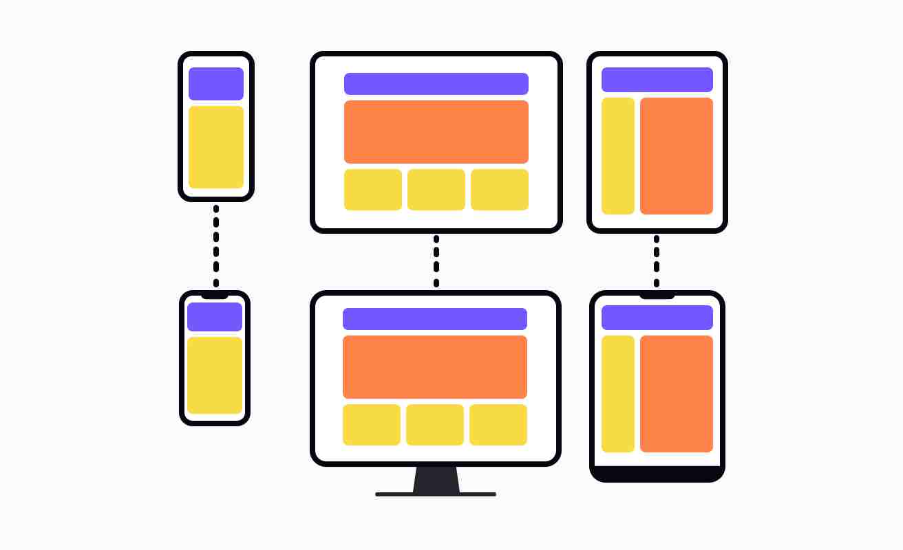
Adaptive design is a web design technique that uses CSS and HTML to create a different version of the same website that is tailored to different types of devices and screen sizes. This allows for a single website to be optimized for multiple devices, while maintaining the overall design integrity and user experience. This technique allows website designers to create a consistent experience regardless of the user’s device or screen size.
The key goal of adaptive design is to provide all users with a similar experience, allowing them to find the information quickly and intuitively. With adaptive design, web designers can create a unified web experience that is optimized for a range of devices, from desktops to mobile devices.
Adaptive design is different to responsive design in that it alters the website using predetermined breakpoints, while responsive design changes based on the devices layout. The website will often feature additional components, such as larger text size, and a simplified navigation menu.
Adaptive design helps define the user experience across all devices, allowing for a single website to be used on many different platforms. This saves time and effort, while ensuring that the user experience is consistent across all platforms. This is increasingly important in the technology landscape, as it has become common for users to access websites from different devices and screen sizes.